
Logopedia

About the client
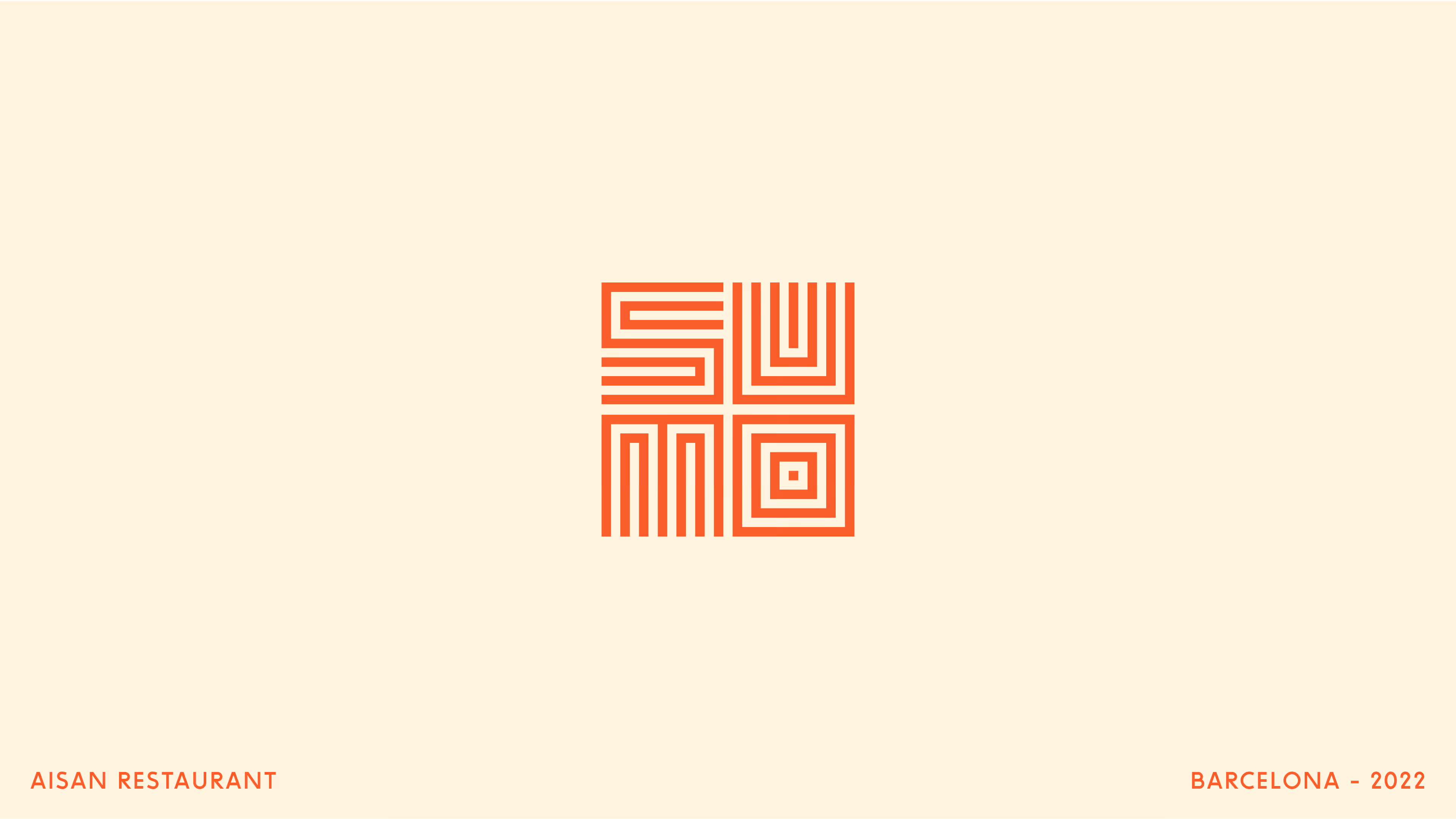
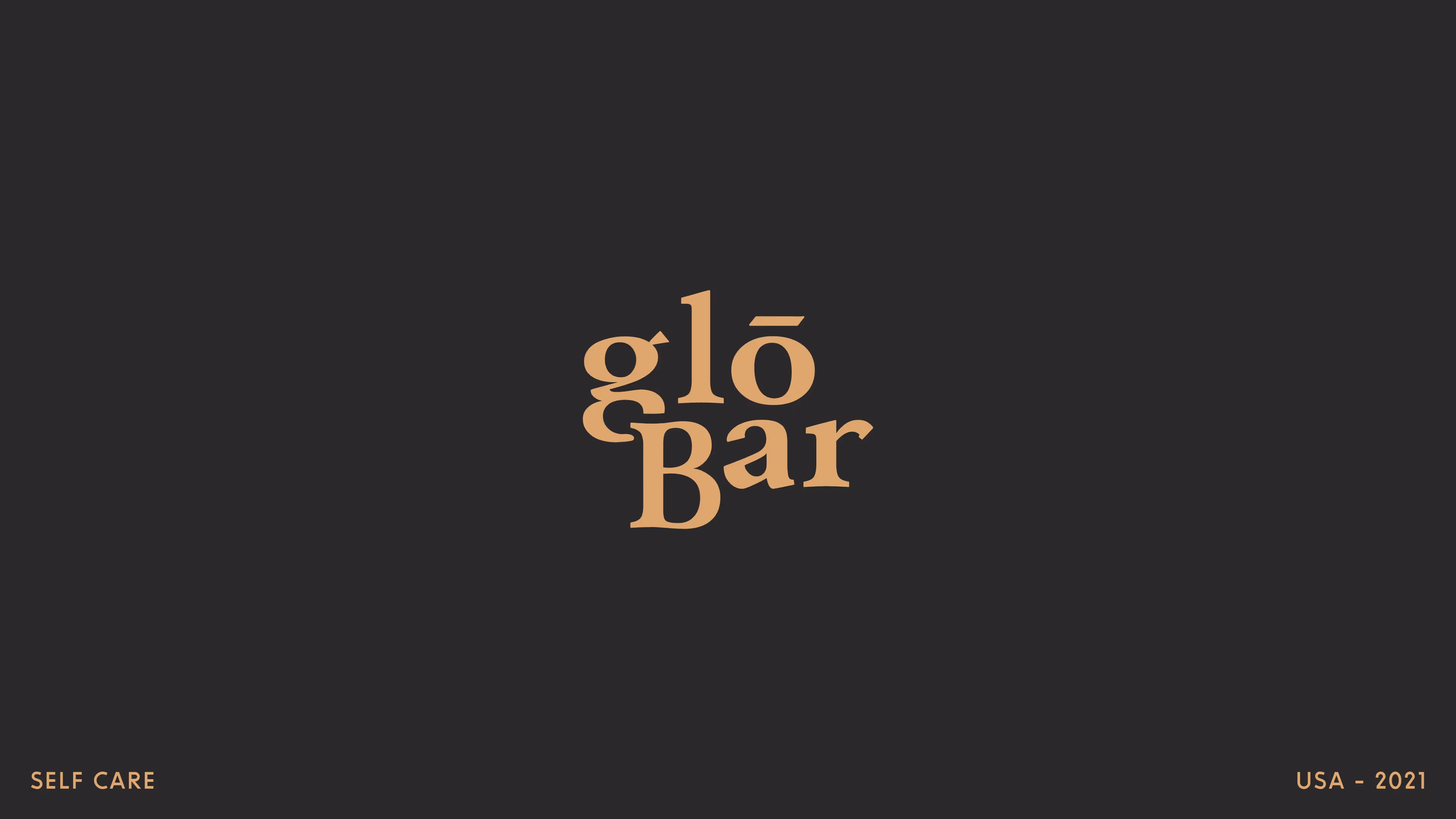
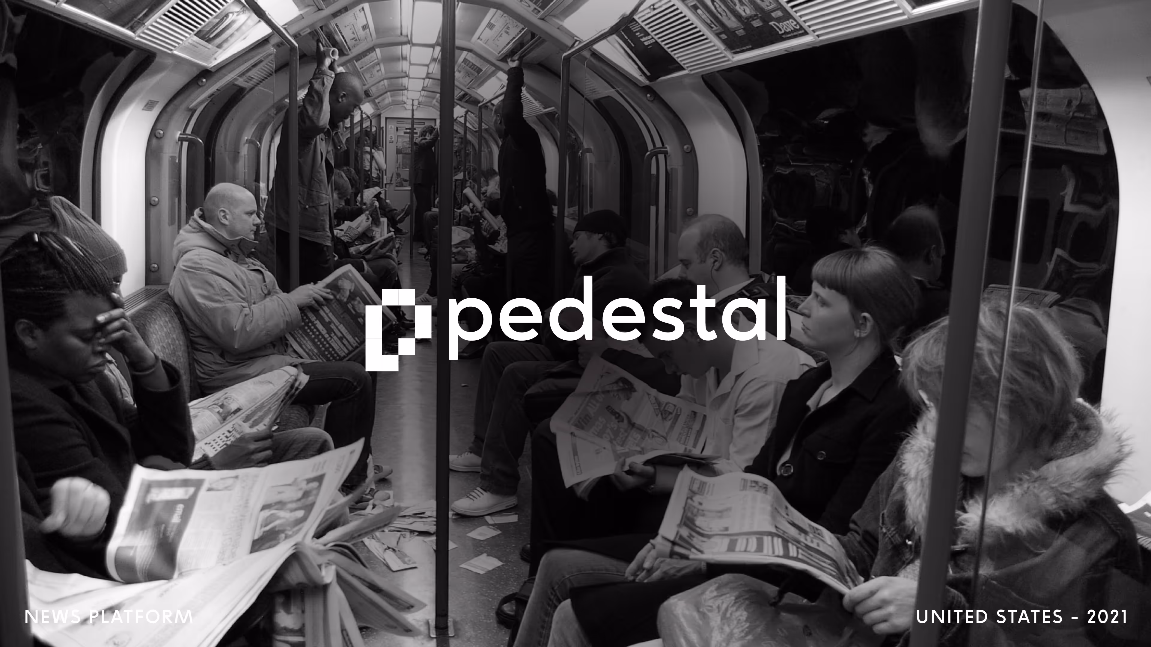
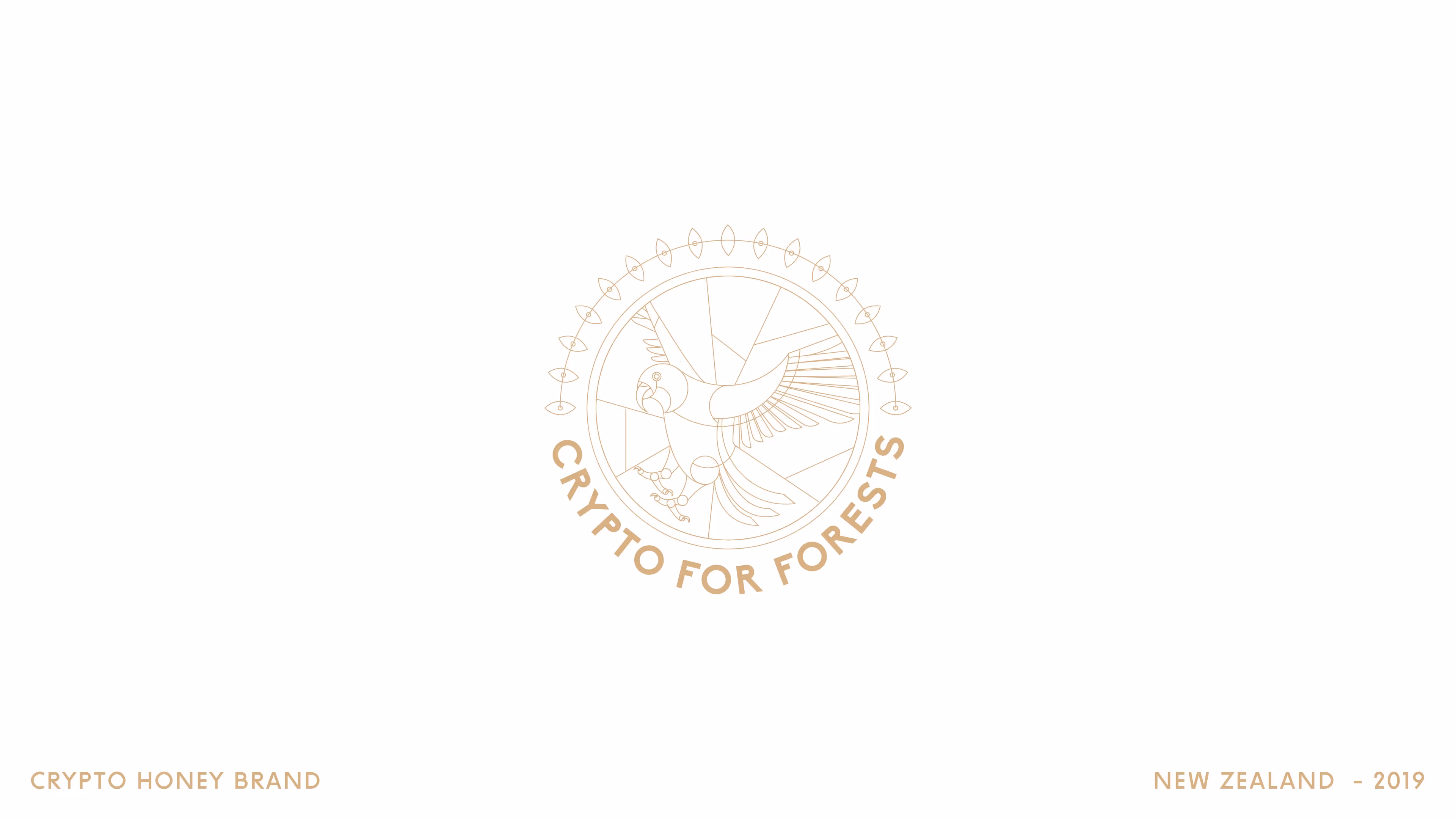
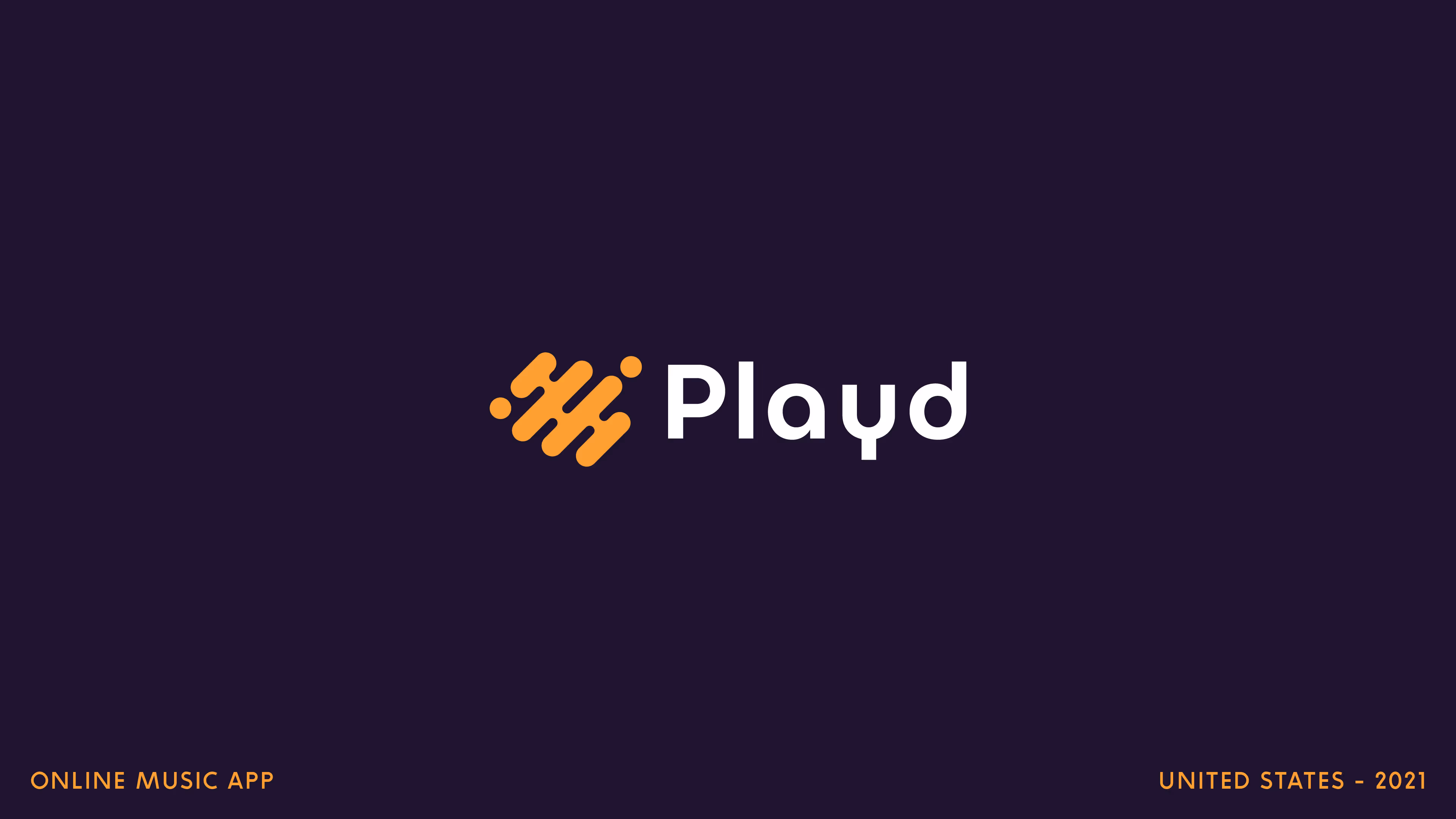
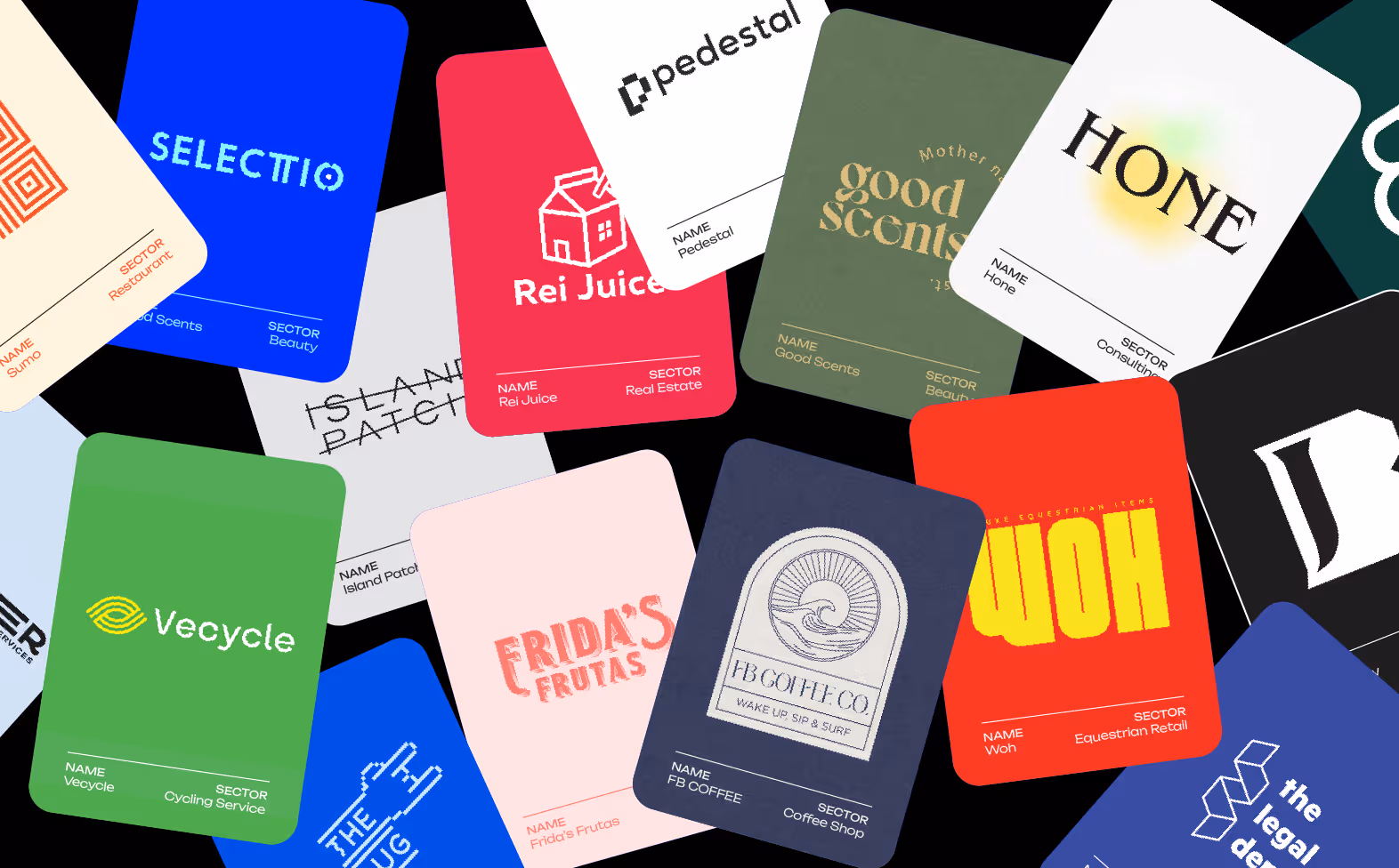
A curated selection of logos and identity marks developed across a wide range of industries, from cultural and creative sectors to commercial and consumer brands. Each project responds to a distinct context, audience, and set of constraints.
Rather than following a single visual style, the work explores different formal and typographic approaches, always grounded in concept and clarity. Each mark is designed to function as a recognisable entry point into a broader brand system.


The Challenge
Each identity begins with understanding what defines the brand at its core. From there, we translate that thinking into a visual form that is both simple and memorable.
Some marks rely on bold, graphic gestures, while others are built through subtle typographic decisions. The approach shifts depending on the needs of the project, allowing each identity to find its own balance between expression and restraint.
Form, proportion, and composition are treated as primary tools. Whether through symbol, logotype, or hybrid systems, each solution is designed to be flexible and durable across different applications.

.avif)

.avif)
.avif)
.avif)
.avif)
.avif)

Our Approach
Each identity begins with understanding what defines the brand at its core. From there, we translate that thinking into a visual form that is both simple and memorable.
Some marks rely on bold, graphic gestures, while others are built through subtle typographic decisions. The approach shifts depending on the needs of the project, allowing each identity to find its own balance between expression and restraint.
Form, proportion, and composition are treated as primary tools. Whether through symbol, logotype, or hybrid systems, each solution is designed to be flexible and durable across different applications.


Outcomes
The result is a body of work that reflects both range and consistency. Each identity feels distinct, yet part of a broader design approach rooted in clarity and purpose.
This diversity allows brands to communicate with greater precision, helping them establish a clear presence within their respective markets. Over time, the collection demonstrates not a fixed aesthetic, but a consistent way of thinking.

OUR PARTNERS
Good design doesn’t happen in a vacuum: It starts with a conversation. If you have a brand to build, a vision to refine, or a challenge to solve, let’s figure it out together.
