
Peninsula Gallery
About the client
Peninsula is a contemporary art gallery based in New York, focused on emerging and experimental practices. Its program sits at the intersection of concept and form, bringing together artists whose work challenges perception and context.
After years with an unchanged identity, the gallery had outgrown its visual presence. What once felt neutral had become indistinct, no longer reflecting the specificity of its curatorial voice.


The Challenge
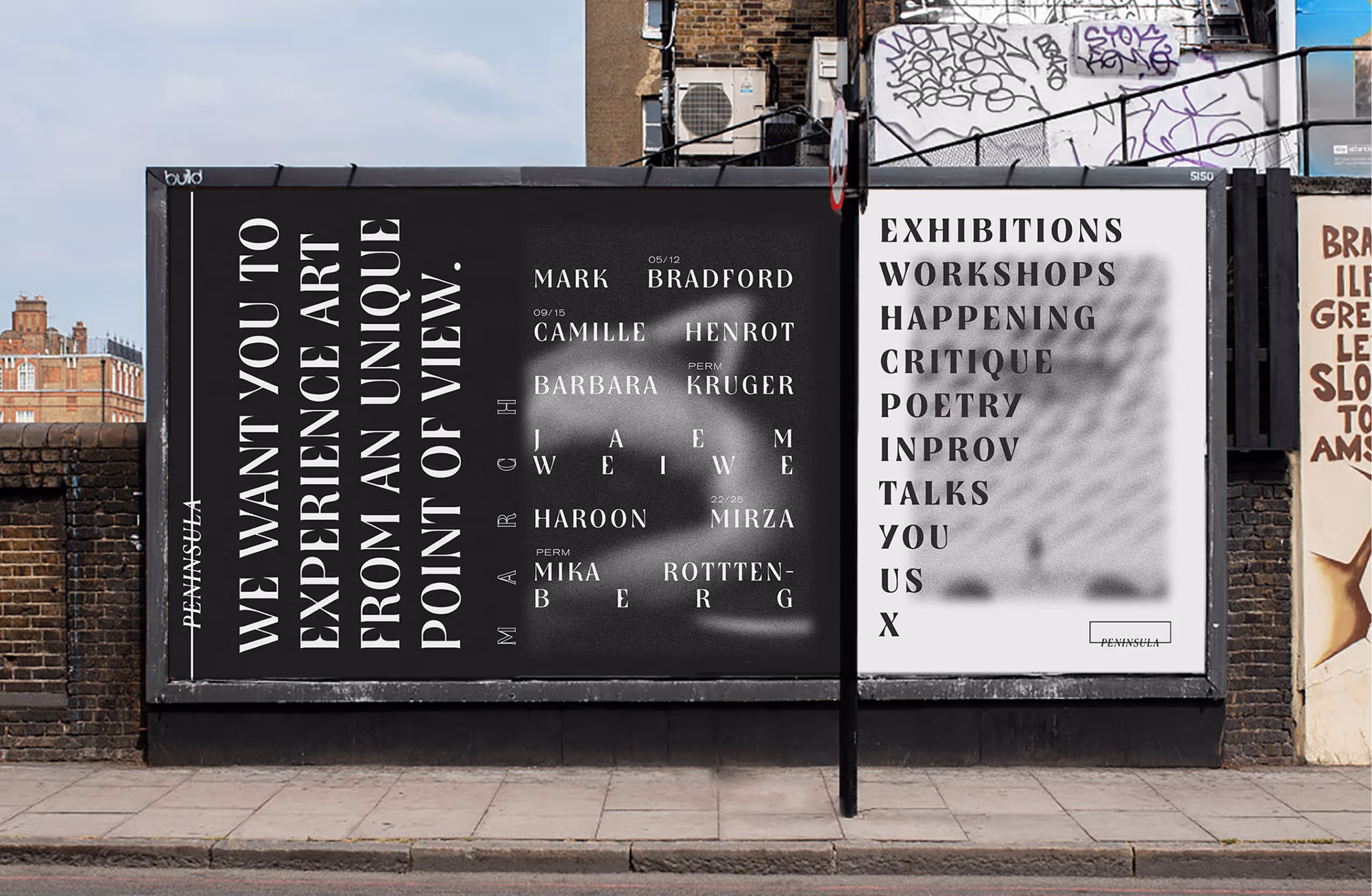
We built the identity around the idea of perspective.
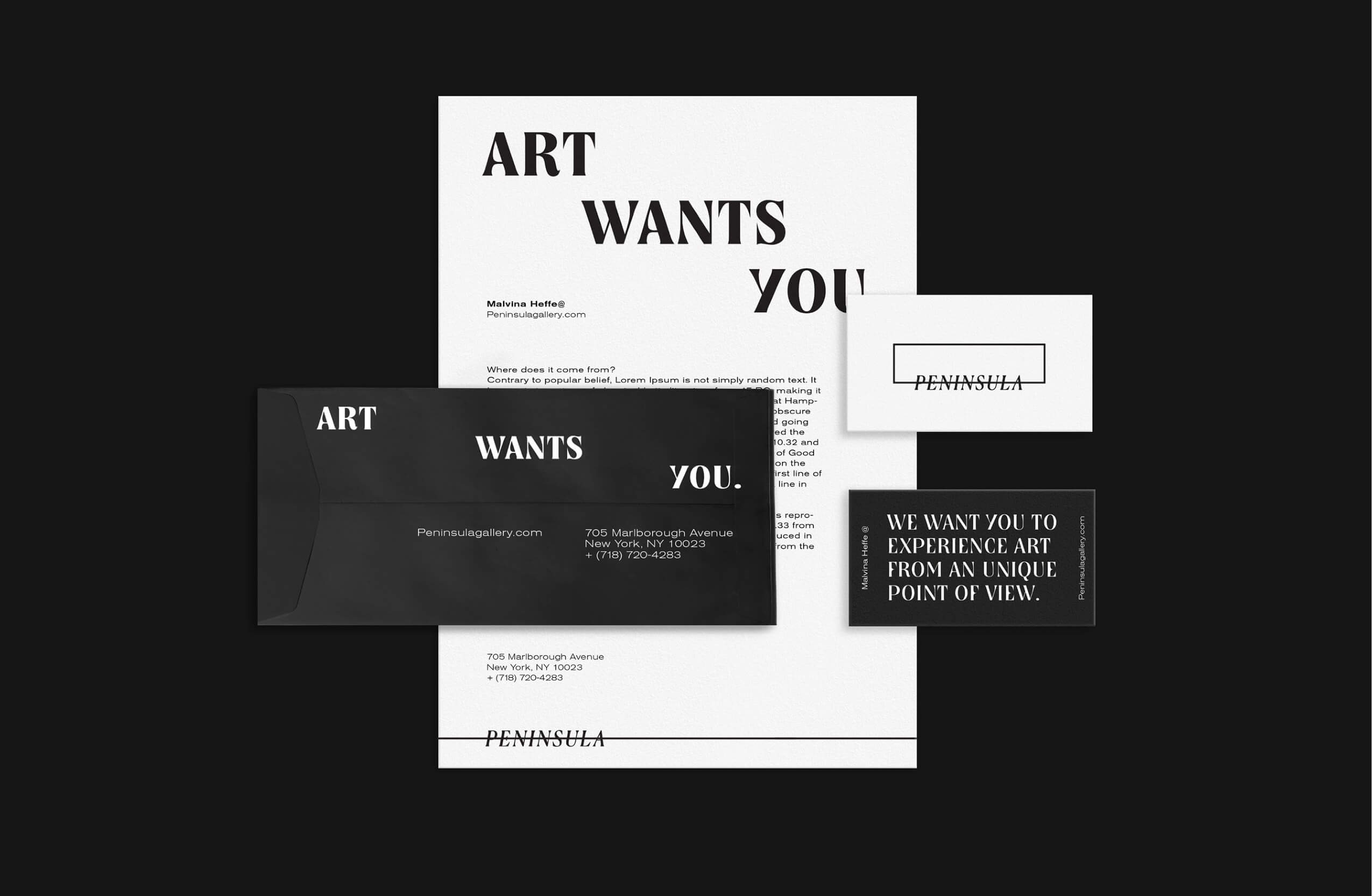
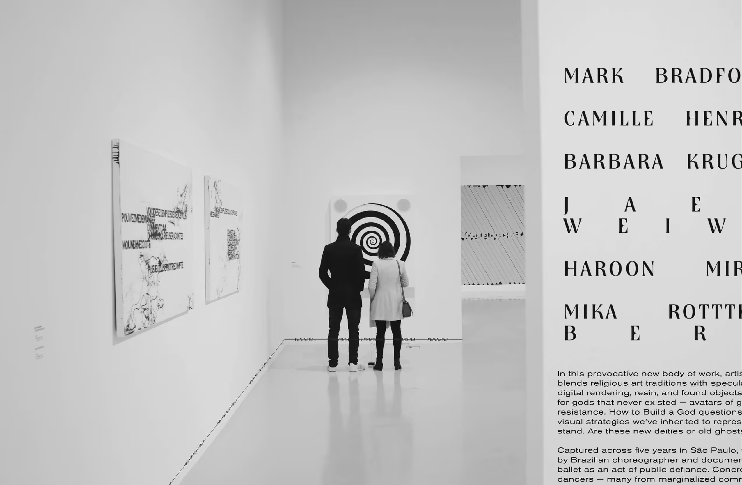
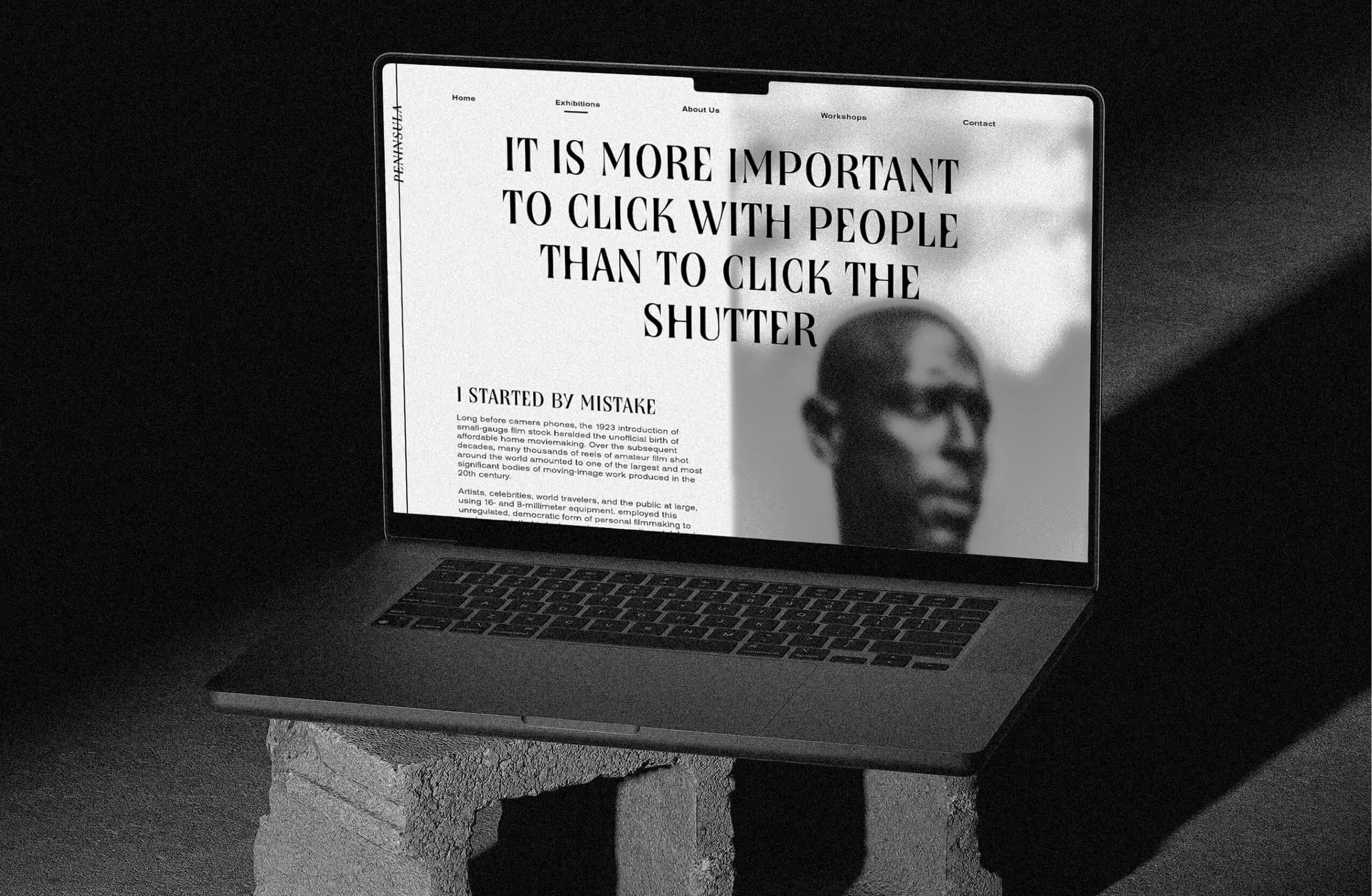
The logo operates as a framing device, establishing a point of view rather than a fixed symbol. It suggests that the gallery is not just a container for art, but a lens through which it is seen.
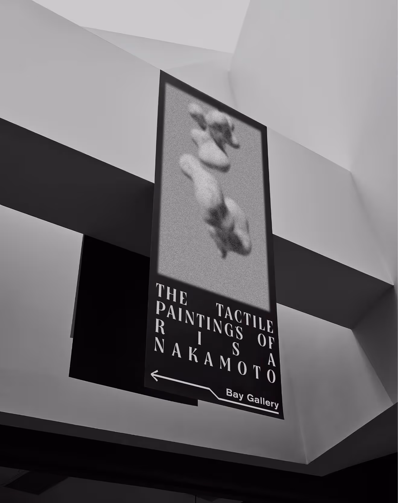
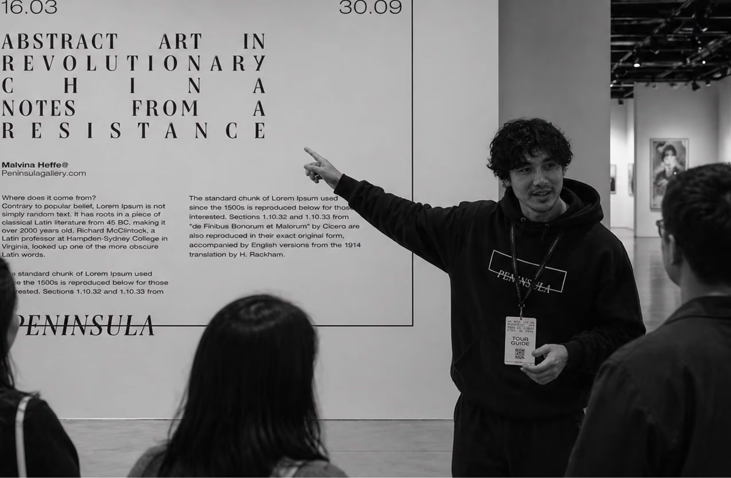
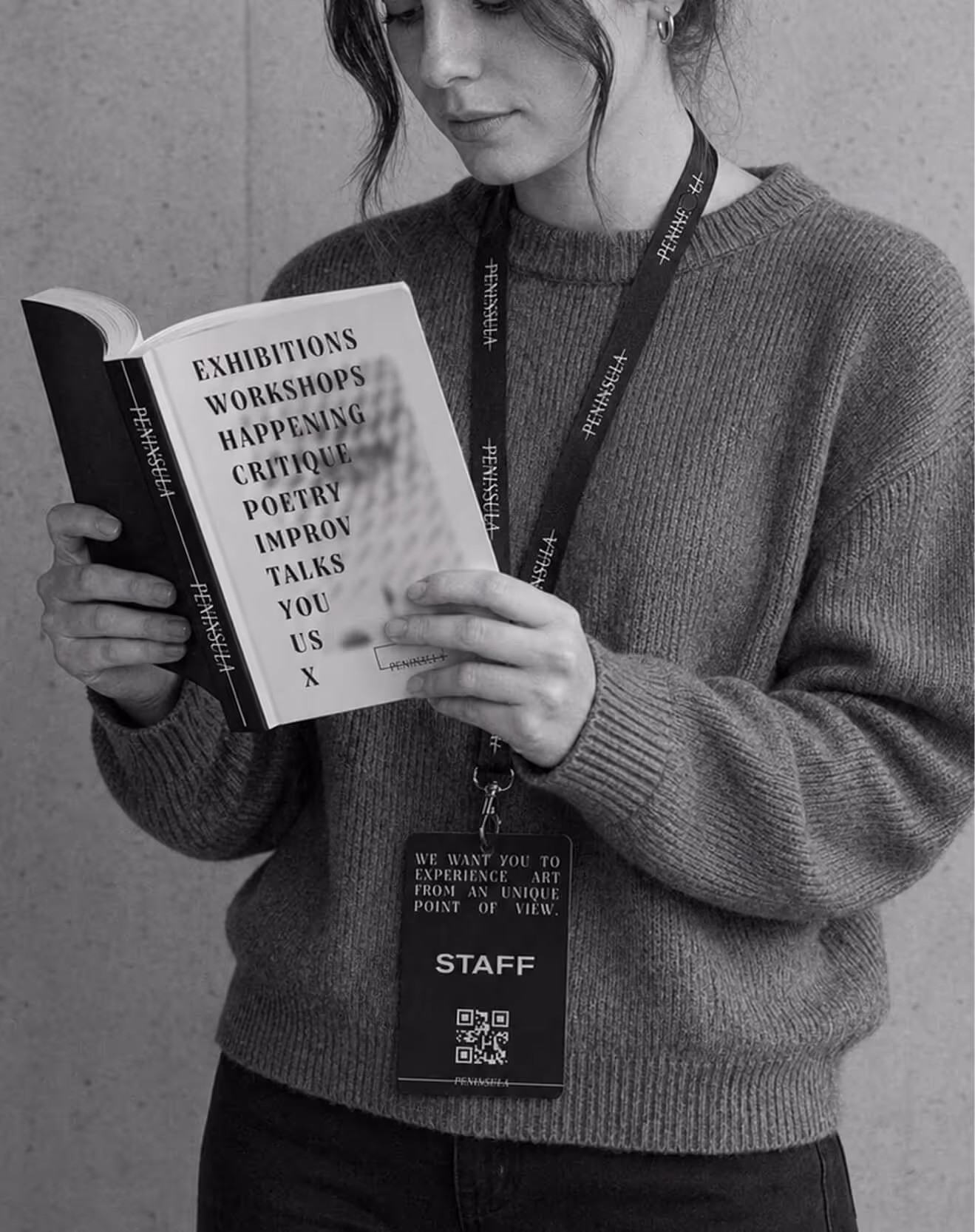
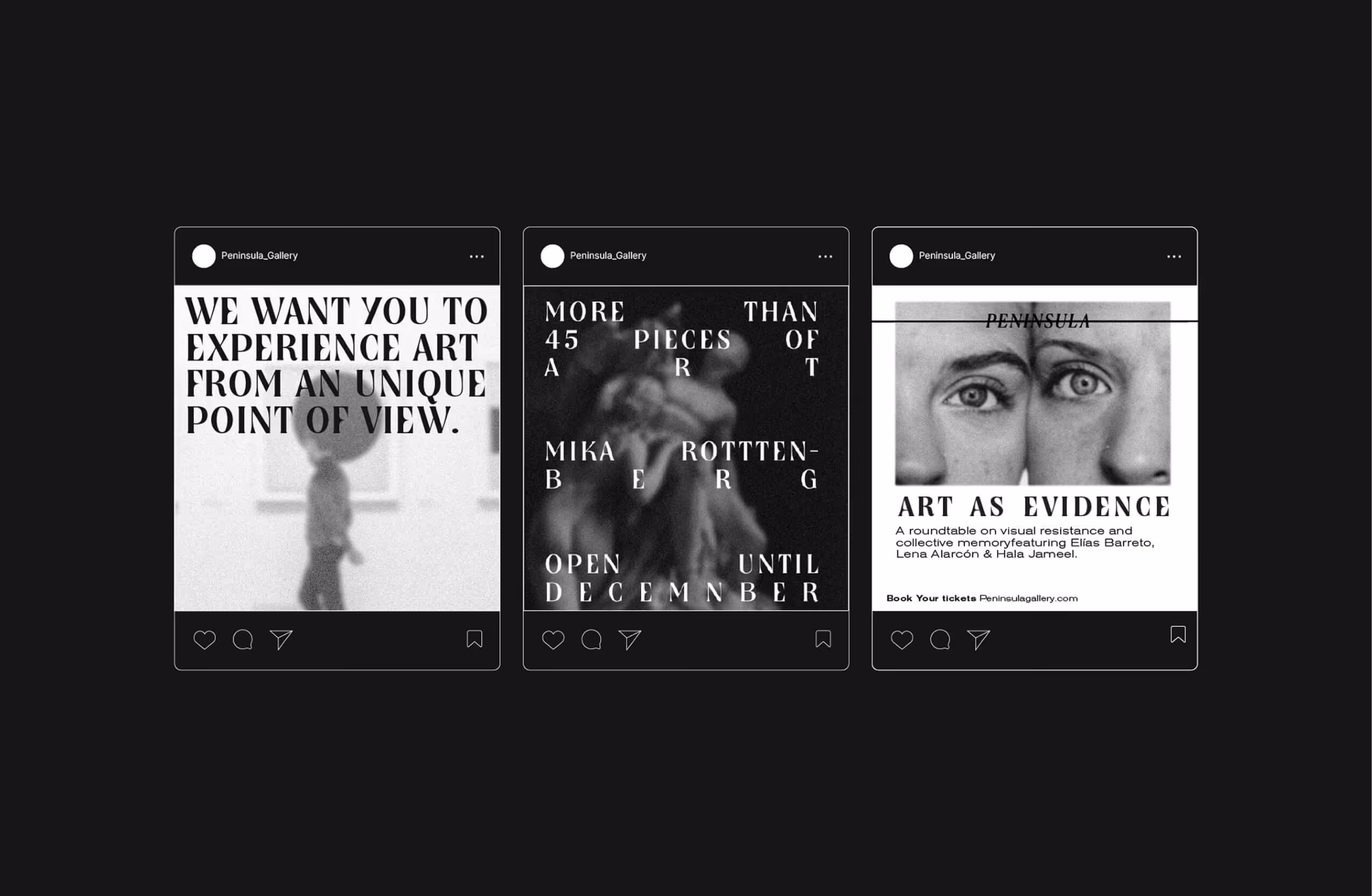
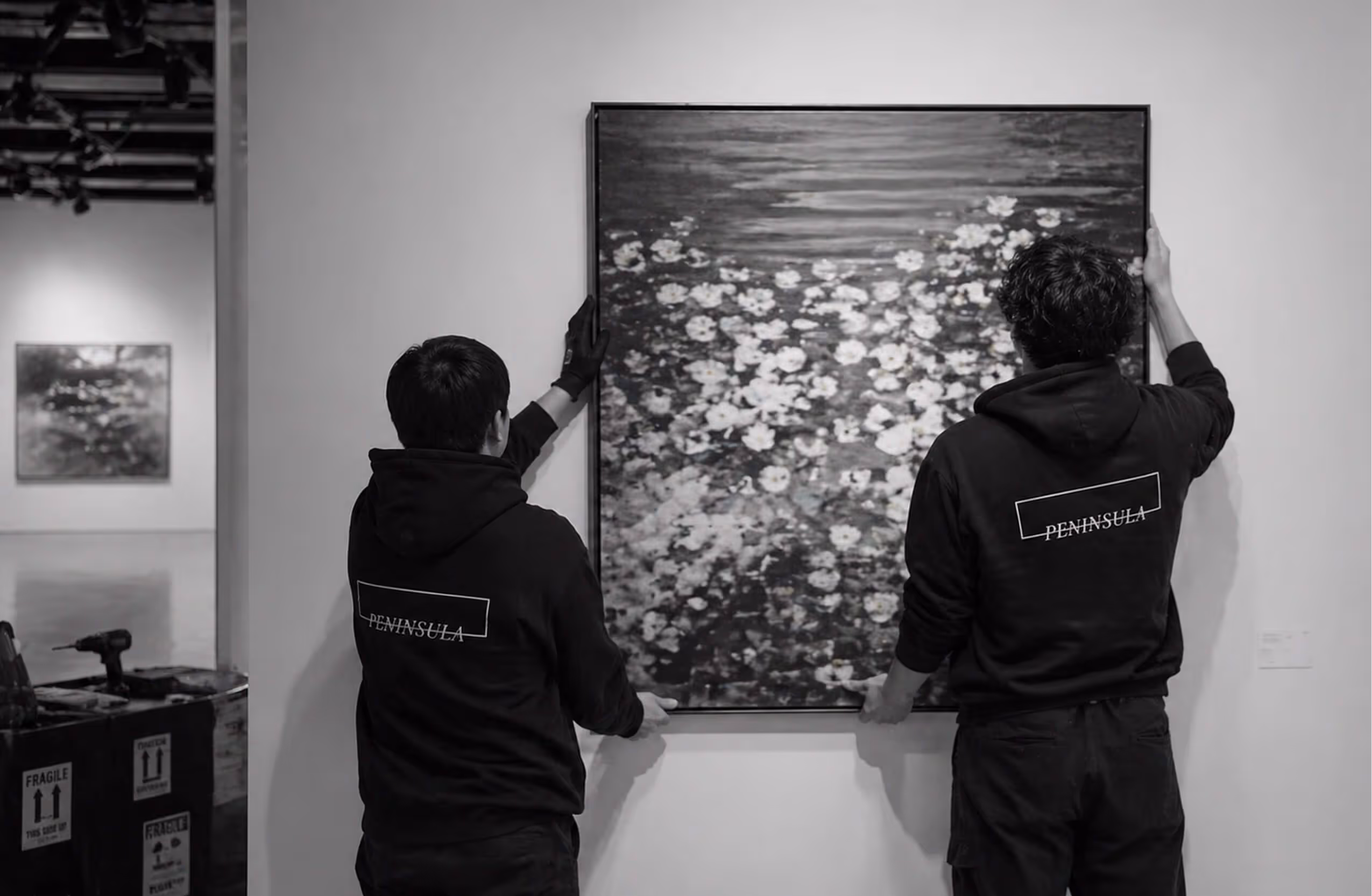
The visual language is reduced to black and white, creating a controlled environment where contrast and composition do the work. Imagery is treated with blur and noise, softening definition and introducing a sense of distance. The result is a visual field that feels intentional yet slightly unstable, echoing the experience of encountering unfamiliar work.
Typography plays an active role within the system. It shifts in scale and placement, at times interrupting the image, at others receding into it. This creates a constant negotiation between clarity and ambiguity, reinforcing the idea of the gallery as a space shaped by perception.
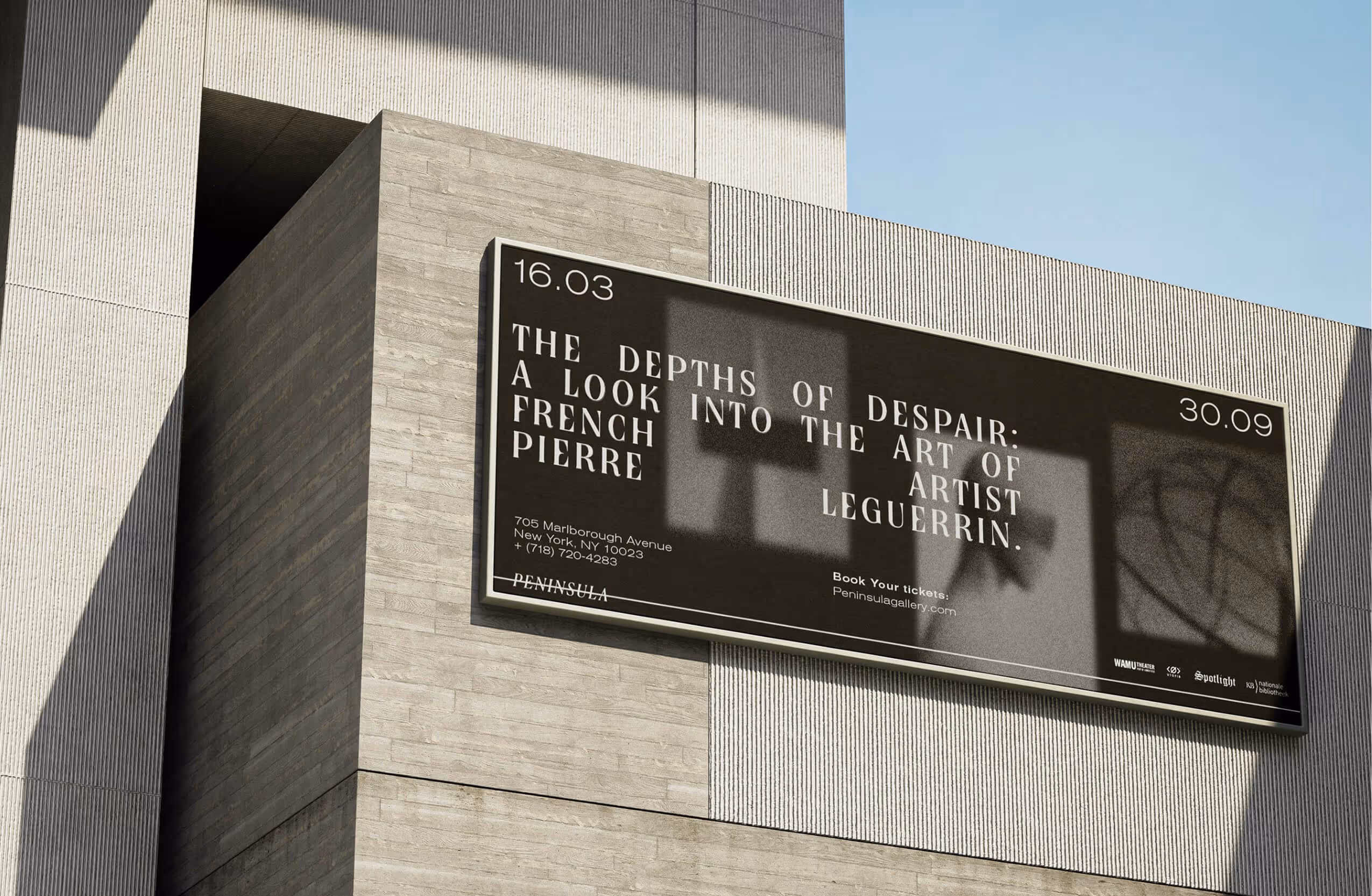
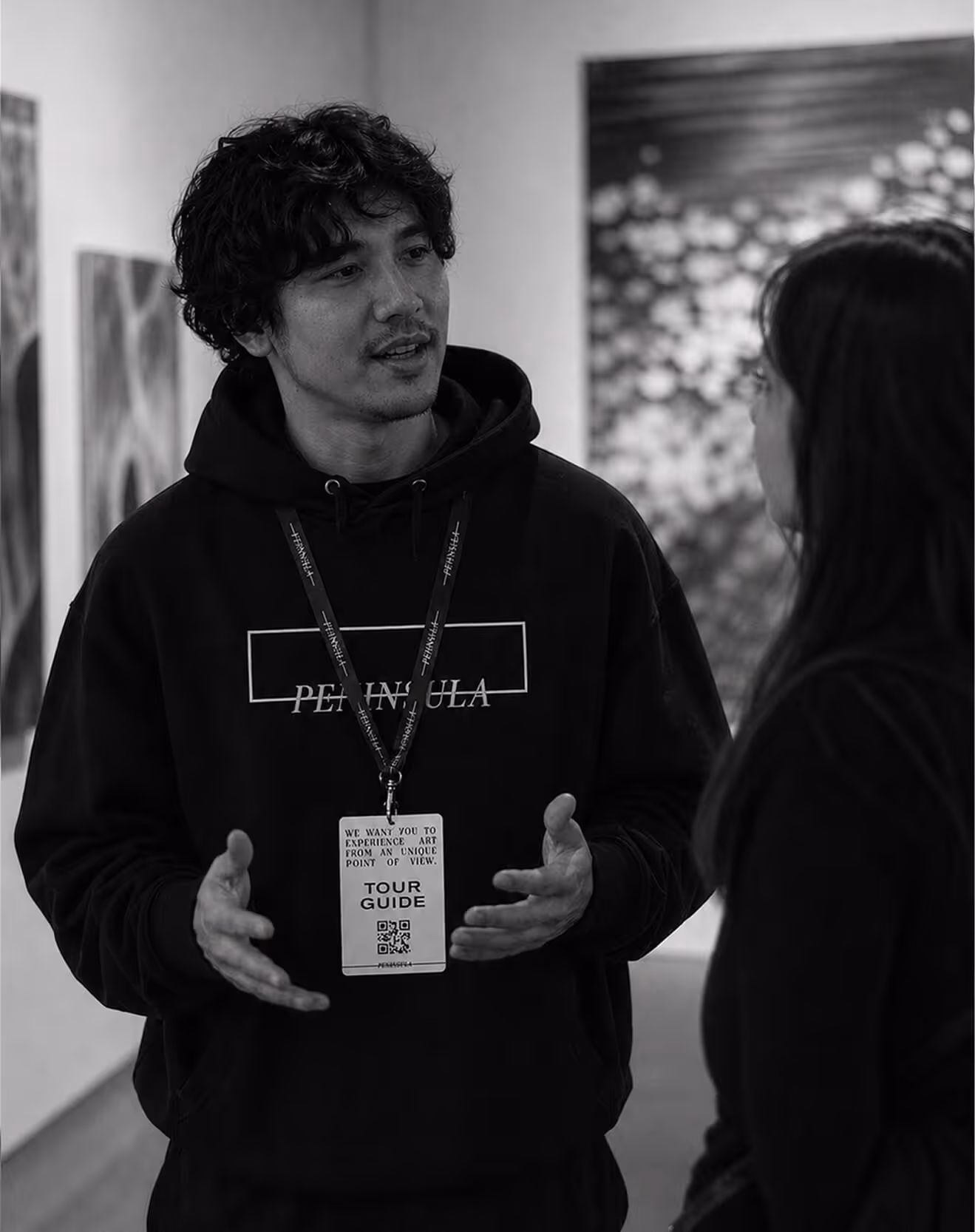
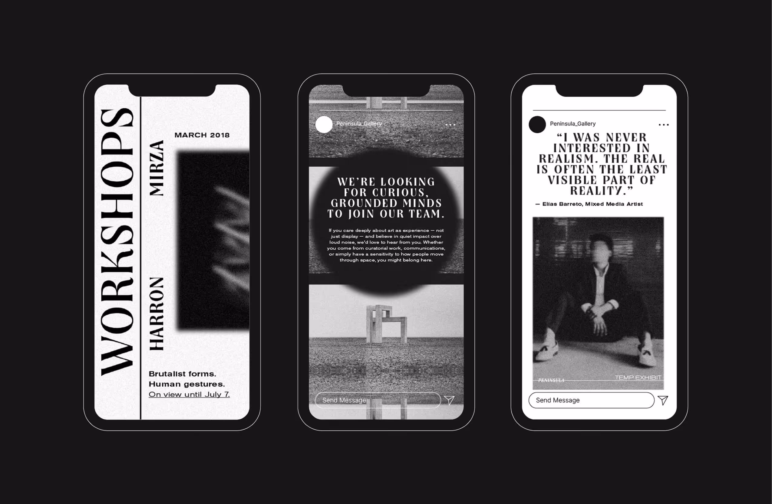
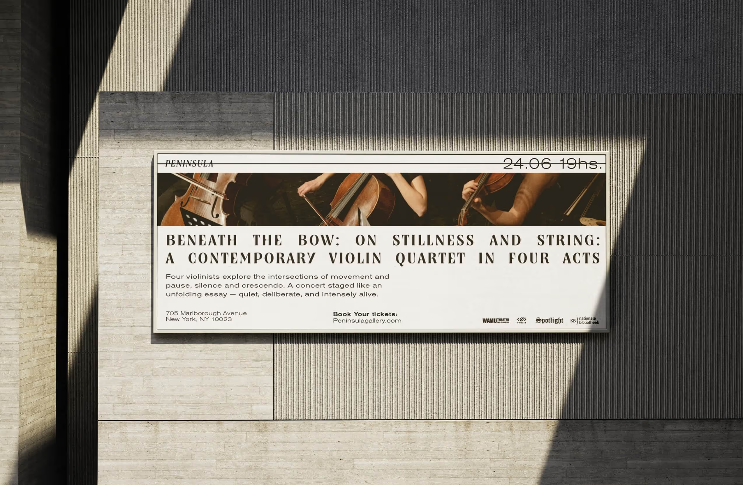
The identity extends across signage, exhibition materials, and large scale applications. Exterior banners act as markers within the city, while maintaining the same restrained language, turning the gallery into a quiet but distinct presence


Our Approach
We built the identity around the idea of perspective.
The logo operates as a framing device, establishing a point of view rather than a fixed symbol. It suggests that the gallery is not just a container for art, but a lens through which it is seen.
The visual language is reduced to black and white, creating a controlled environment where contrast and composition do the work. Imagery is treated with blur and noise, softening definition and introducing a sense of distance. The result is a visual field that feels intentional yet slightly unstable, echoing the experience of encountering unfamiliar work.
Typography plays an active role within the system. It shifts in scale and placement, at times interrupting the image, at others receding into it. This creates a constant negotiation between clarity and ambiguity, reinforcing the idea of the gallery as a space shaped by perception.
The identity extends across signage, exhibition materials, and large scale applications. Exterior banners act as markers within the city, while maintaining the same restrained language, turning the gallery into a quiet but distinct presence


Outcomes
The new identity established a clearer position for Peninsula within New York’s art landscape. It introduced a visual language that is both recognizable and adaptable, capable of supporting a wide range of exhibitions without losing coherence.
The gallery gained a stronger presence across physical and digital touchpoints, with materials that feel more aligned with its curatorial intent. Artists and collaborators responded positively to the shift, recognizing a framework that enhances rather than competes with the work.
The result is an identity that does not seek attention directly, but shapes how attention is given.

OUR PARTNERS
Good design doesn’t happen in a vacuum: It starts with a conversation. If you have a brand to build, a vision to refine, or a challenge to solve, let’s figure it out together.
